The State of Data Journalism 2022 Survey
a project for the European Journalism Centre
For the second year in a row, I have been in charge of a global survey aimed at the data journalism industry, designed and delivered for the European Journalism Centre’s DataJournalism.com. The project constitutes the largest survey of data journalists worldwide, and this year the survey’s second edition saw over 1800 people participating.
In the media
- European Journalism Centre’s announcement
- Journalism.co.uk article
- Twitter thread by Simon Rogers
- Dedicated panel at the International Journalism Festival 2023
Tasks
In the project, tasks included:
- create the survey and spread it
- analyse the results
- visualise the results
- create a website where to present the visual results
- write textual content to accompany the visuals
- release an open version of the dataset
Presenting the results
The results are contained in a nested website, where visualisations are grouped by survey topic (e.g., demographics, employment, challenges) and stored in separate pages. This choice was made to allow the visualisations to load quickly, and to prevent users from feeling as if they were drowning in a huge amount of material (the survey was quite long as it had 63 questions, and there are hundreds of resulting visualisations).
From the homepage, one can get a sense of which topic exists and visit the results specific to that. If they scroll down, instead, they can read our selection of the key takeaways, read a methodology and survey metadata, or a mission statement.

Each of the results pages presents its sub-topics (oftentimes they match a survey question) through a series of buttons. The buttons can be clicked to head straight to the sub-topic of interest, or else one can scroll down the page to see the results in full.

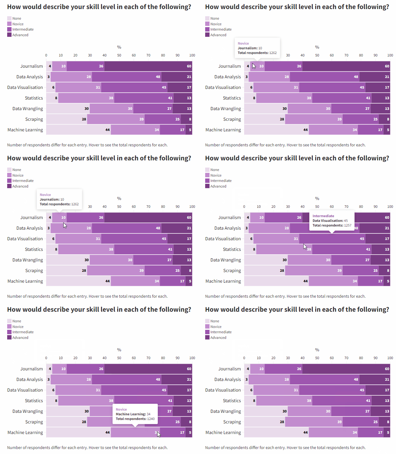
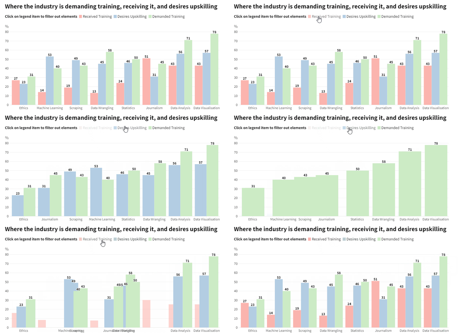
As this was the second time I worked on the project, I strived to improve last year’s work by making a few small but impactful tweaks. Among the changes, I repositioned the axes, made the color palette lighter, introduced automated textual popups, increased the interactivity of the charts, introduced new visualisations.


Color palette
I felt the purple was too intense, and changed it to a colder and lighter shade (see below). I think it overall makes everything much lighter on the eye and takes away weight from the page. I also introduced a new sequential and a new discrete color palette

Automated custom popups
This year most visualisations feature a “textual” popup. I felt it better explained the data points. I am really happy with this feature, I had to “code” it in a custom way for each graph.

Higher interactivity
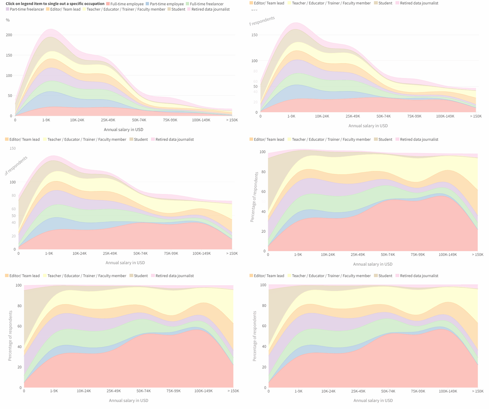
I have added new control features to make the plots more interactive. Last year I restrained from doing this as I did not want to overload the user, but this time I felt I wanted to simplify the visuals, and make them more dynamic. After all, I want users to be able to play with the data, and avoiding confusing them.

New visualisations
Last year I relied heavily on barchart. They felt, often, like an appropriate choice of chart for the data. I though felt the pages became a bit boring, that there was little visual variation. This year, being faster at processing the data, I had a little time over to a) explore new intersections between variables, b) explore new visuals. I introduced scatterplots, quadrant plots, areacharts, that overall vary our outputs and better suit the data.


Grids and aspect ratio
It was nearly the last thing on my mind, but potentially the one that had the highest impact in terms of improvements: aspect ratio and gridlines. I reduced the number of grids, and squished the graphs a bit.
